Improve Data Presentation Using a Word to PDF Tool
Effective data presentation is vital for business success. In organizations, you have to share important reports with clients, present insights to stakeholders, or else collaborate with colleagues. In all these situations, it is how you present your data that makes a sound impact.
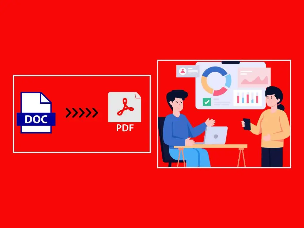
Data presentation is not just about throwing numbers onto a page. Rather, it is about delivering any kind of complex information clearly and comprehensively. However, there are certain challenges in achieving this. These challenges are identified as dealing with large datasets or communicating complex ideas. This is where a Word-to-PDF tool can be incredibly valuable.
In this article, we will explore how using a Word-to-PDF tool can enhance your data presentation efforts and help you communicate more effectively.
Key Takeaways
- Understand the Importance of Effective Data Presentation in Business
- Learn How Word to PDF Tools Enhance Data Presentation
- Discover the Benefits of Using Different Types of Data Presentation
- Explore Practical Examples of Textual, Visual, and Tabular Data Presentations
- Understand How Smart Tools AI’s Word to PDF Converter Improves Data Presentation
What is Data Presentation?
It is all about properly organizing and visualizing data in a way that is easy to understand and explain. This can include several things such as creating charts, and graphs and formatting text and tables. All of these are for presenting the intriguing data more clearly.
Effective data presentation helps organizations win clients, and enhance their sales, business reputation, investment potential from investors, and many other essential things.
Benefits of Using a Word-to-PDF Tool for Data Presentation

Now you know what is data presentation and to enhance its benefits, Smart Tools AI offers a Word-to-PDF tool that helps you in the following ways:
Ensuring Consistency and Professionalism: With the help of a Word-to-PDF tool, you can ensure that your data presentation has a consistent look and feel. Plus, you don’t need to worry about who creates them. Converting Word to PDF helps ensure professionalism and maintain a good image for your business.
Security and Data Protection: PDFs are a secure file format compared to Word files. This makes them ideal for sharing sensitive information. A Word-to-PDF tool helps convert your Word documents to PDF format quickly and ensures that your data is secured.
Easy Sharing and Distribution: You can easily share PDFs using different devices. This is a crucial benefit for collaboration with working colleagues and enables you to share reports with clients.
Enhanced Readability and Layout Control: PDFs offer greater control over formatting and layout compared to Word documents. With a Word-to-PDF tool, you can ensure that your presentation is easy to read and visually appealing.
How to Structure an Effective Data Presentation

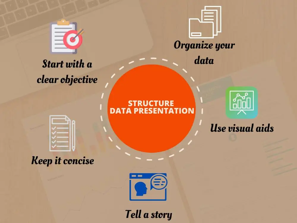
When you prepare your presentation you have to follow these tips that are useful for structuring it effectively:
- Start with a clear objective: Before creating your presentation, you just need to take some time to define the objective clearly. This is essential for your audience to understand the presentation.
- Organize your data: You have to arrange your data in a logical order that can help your audience to follow easily. This means presenting your data by category and in good order is important.
- Use visual aids: Visual aids like charts, graphs, and images are helpful to clarify complex data and make your presentation more engaging. However, it is not better to overuse visuals. Add the most relevant and impactful visual aids to support your message.
- Tell a story: Rather than just presenting your data you have to tell a story with it. Use your data to guide your audience through a narrative that leads to your desired conclusion.
- Keep it concise: It is always better to keep it concise. Avoid too much information that can be boring to your audience. Always keep your presentation focused and highlight the most important points.
Types of Data Presentation
There are mainly three types of data presentation. This depends on the nature of the data and the audience you are presenting to. Let’s see them one by one:
A. Textual Data Presentation
This type of presentation conveys information via written content. This is effective for detailed explanations and narratives.
Example:
A company’s quarterly sales performance report may include sections like:
Introduction:
Our Q1 sales objectives focused mainly on increasing market penetration and improving customer retention.
Sales Data Analysis:
- In Q1, we achieved a 10% sales growth compared to Q4.
- The new marketing campaign contributed significantly to this growth.
- Customer retention rates improved by 5%.
Summary:
The strategies implemented in Q1 have shown positive results, and we recommend continuing with the current marketing efforts while exploring new customer acquisition channels.
B. Visual Data Presentation
Visual data presentation generally uses charts, graphs, or any other visual aids to present the data more understandably.
Example:
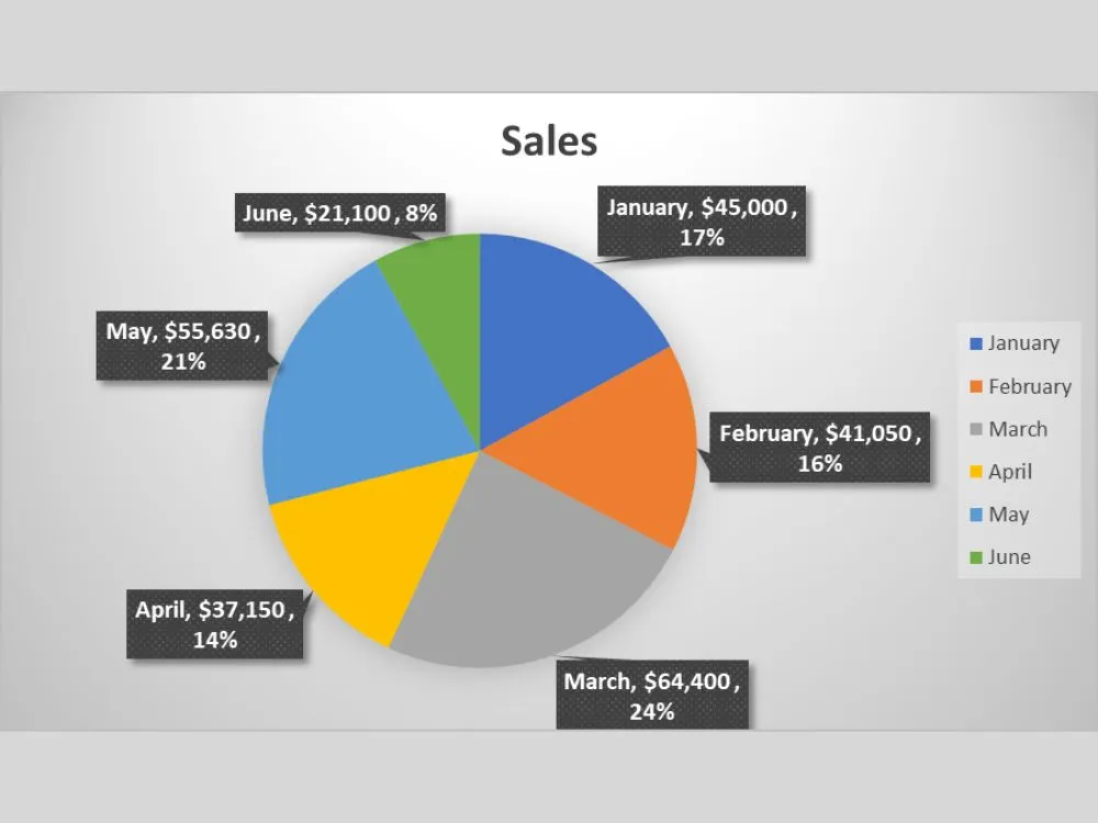
A Pie chart showcasing the monthly sales of a company with the percentage amount for the last six months of 2024.

This type of visual aid helps the audience easily understand the data content presented by the individual or sales team. This may give an overall idea and a clear picture of what strategies should be followed to further enhance sales in the coming months.
C. Tabular Data Presentation
This type of presentation organizes data in tables which allow for easy comparison and analysis.
Example:
A table comparing sales performance for different quarters in a year across different regions.
| Region | Q1 Sales | Q2 Sales | Q3 Sales | Q4 Sales |
|---|---|---|---|---|
| North | $1200k | $1300k | $1400k | $1500k |
| South | $900k | $950k | $1000k | $1050k |
| East | $700k | $750k | $800k | $850k |
| West | $1100k | $1150k | $1200k | $1250k |
The table allows for a quick comparison of sales performance across regions and quarters. So, it is easy to identify trends and areas for improvement. By using these examples, you can see how different types of data presentation can be effectively utilized to convey information clearly and compellingly.
Data Presentation Examples
To illustrate the benefits of using a Word-to-PDF tool for data presentation, let's consider a few examples:
Before and After Comparison
Imagine you are preparing a report for a client. Your first approach is to prepare the report in its original Word format and it lacks professionalism. Here, you just need a Word to PDF tool which helps convert Word documents to PDF format quickly.
After converting the report to a PDF format, it can ensure that the report looks clean, professional, and easy to share and present.
Case Study: Improving Client Reports
A marketing agency is required to prepare monthly reports for its clients. In this case, it utilizes the Word-to-PDF tool to turn its unprofessional Word reports into professional-looking PDF reports that impress clients and enhance the agency's reputation.
How to Use a Word-to-PDF Tool for Data Presentation
As we discussed earlier, a Word-to-PDF tool helps convert Word documents to presentable and shareable PDF formats. Here are the steps to follow to do the conversion:
- Upload your Word document (s): Upon visiting the tool’s page, you will find an option to upload Word file (s) using the 'Select a File' button.
- Convert to PDF: Once you finish uploading the files, just click the 'Convert to PDF' button, and within seconds, you will get the converted PDF files.
- Download your PDF: After the conversion, you can download the PDFs to your local device with the downloading option available. You have two options to download the converted files. You can choose the ‘Download All’ option to quickly download all converted PDFs, or else you have another option to individually download selected files.
This conversion lets you ensure that your data presentation is professional and accessible to your audience.
Best Practices for Data Presentation in PDF
When presenting data in PDF format, you need to follow some best practices. This can ensure that your presentation is clear, professional, and effective. Here are some tips:
- Use clear and appropriate fonts in suitable sizes.
- Bold or add other text styles to grab the attention
- Give importance to formatting and layout.
- Include descriptive titles and labels for charts and graphs.
- Keep the design clean and uncluttered.
- Test your presentation on different devices to ensure compatibility like on mobile phones, tablets, desktops, etc.
Conclusion
Effective data presentation is crucial because it helps deliver the message effectively to the client, stakeholders, and other relevant parties. A Word-to-PDF tool can be a great assistant to improve your data presentation efforts.
PDFs are an ideal format for sharing and presenting data professionally. By following the tips and best practices outlined in this article, and by utilizing our user-friendly conversion tool, you can create data presentations that effectively communicate your message and drive business success.
Additional Resources and Guides
Google Career Certificates: https://youtu.be/CzrCADdsXwE?si=H9cpKT9I6mpGVOx3
.webp)